
The Backstreets of Venice
The Backstreets of Venice. Turning photographs into AI-generated watercolour art, brings a new depiction to the atmosphere of these narrow lanes and waterways, that bear silent witness to centuries of Venetian life.
Many believe that the true soul of Venice lies beyond the tourist landmarks and the crowds. These pedestrian and watery arteries that wind through the city’s heart, do not announce themselves – they simply wait to be discovered!
For this portfolio, I decided that since Venice is an aquatic city, creating watercolour-inspired pieces would be fitting. In Firefly’s software now included in Photoshop, I used “generative fill” to create the watercolour derivatives and firstly chose the Gemini 3.1 (Nano Banana 2) generative model setting, then later changed to the what I understood to be a more advanced and consistant model – GPT Image 2. I kept my commands really simple in my learning phase – “turn into a watercolour painting”.
I try to make my photography-based posts instructive, to help others improve their skills and to stimulate interest in new ways of visualizing this remarkable city. To this end in this post, I have included several “before and after” images, which show quite drammatically how different the presentation of the original image and the AI watercolour derivatives really are, and in how they communicate their message.
One thing I have learnt in the few weeks I have been using this software, is that to my mind, the quality of the original photograph, significantly dictates the outcome, success and consistancy of the generated artwork. The Firefly software is extremely complex and “generative fill” is only one of the many tools available. In the learning phase – “keep it simple” is good advice.
Generative artwork will not change my love for traditional photography and my approach to it. To my mind, the way to think of it, is that AI-generated artwork is different – but not necessarily better. Both can produce beautiful imagery, but the outcome using generative fill software alone, is highly dependant on the quality of the original photograph. The other consideration, is that simply changing the generative fill model, produces quite differents watercolour effects. Using a more advanced or sophisticated conversion model, may not produce results that are to your taste. The are no shortcuts to trying them all out.
One thing’s for sure – this Firefly AI-generative fill software converting photographs into artwork is fun to do, rather addictive and initially rather challenging. Judge for yourself!
- Technical Notes
- Introduction. The Backstreets of Venice
- AI Generated Watercolour Images – “The Backstreets of Venice”
- Links (internal–external)
Technical Notes
For this post only Firefly’s “Generative Fill” tool was again used. I made the first conversions with the Gemini 3.1 (Nano Banana 2) model setting, then later changed this setting to GPT Image 2. They give strikingly different watercolour presentations. The majority of photographs, selected from my online website galleries, were made at 1000 pixels on their longest side. Images using Gemini 3.1, were 2x upsampled which is a simple “zero-credits” command, in the generative fill page. This appears to produces a sharper and a slighly improved image quality.
Below are “part-screenshots” of the Firefly software interface with a photo loaded. For this portfolio, I first used the Gemini 3.1 (Nano Banana 2) setting, then later changed this setting to GPT Image 2 as seen below (top left hand side drop down menu). At the bottom right of the screenshot, both settings uses 20 credits (other settings use less or more credits). Next you check that the software has correctly set the format to match the photograph.
I paired it with very simple command prompts – in this case simply “turn into a watercolour painting”. You then press the “Generate” button and wait for the result – roughly 20 seconds in my case.
Aside from 2x upsampling in Firefly, when using the Gemini 3.1 Nano Banana 2 (credit free), the only other processing in Photoshop involved minor adjustments to image density, contrast and colour balance, aiming to create a consistent look, and give the impression that the set of images presented below, came from the same artist’s hand. My goal was to keep things simple, both for consistancy and my own learning curve, as well as to inspire others to give it a try themselves.
Below are the two Adobe generative software programs I tested with Format (set to that of the original image) used and Resolution box settings (as shown).
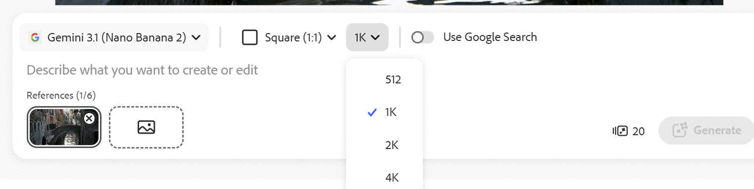
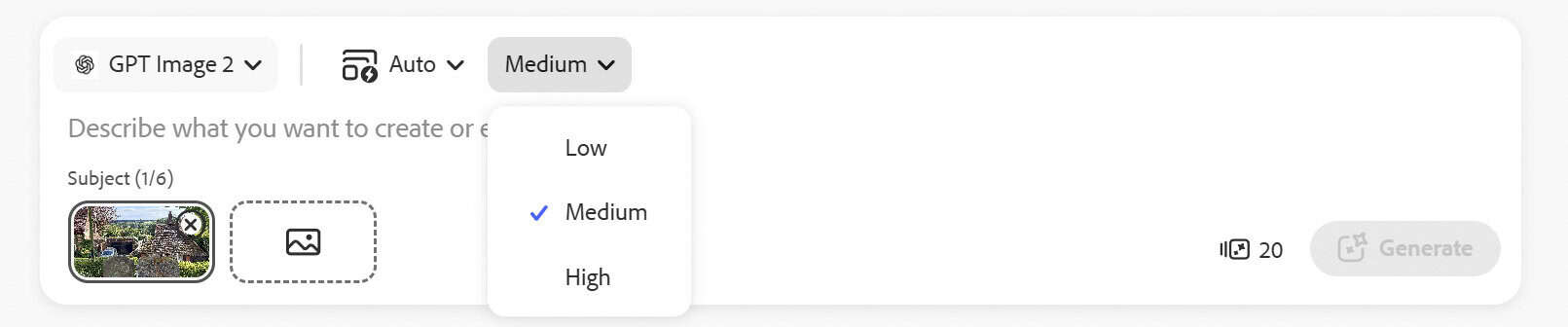
Note. If you’re not a Photoshop user, a range of alternative “free use” sites is given In the “Links Section” below. AI-Generated photography is becoming commonplace – this post offers a link below to my first foray into AI, that also covers: 1. Details about Firefly AI software and a summary of its main features. 2. The ethical concerns and frameworks surrounding the use of AI in photography. As AI continues to advance, these frameworks will likely focus even more on transparency, disclosure, provenance, verification, and accountability to maintain trust in what we see and believe.
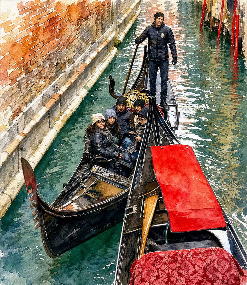
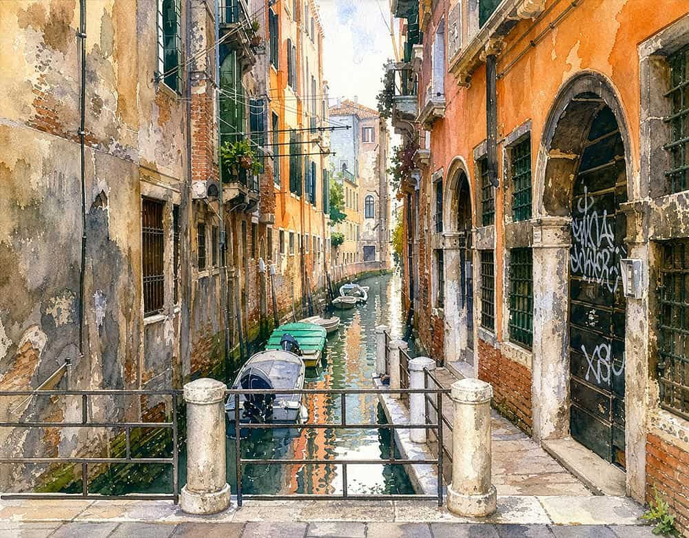
The Backstreets of Venice The Backstreets of Venice The Backstreets of Venice The Backstreets of Venice
Introduction. The Backstreets of Venice
Leave behind the splendour and crowds of the Grand Canal, St Mark’s Square and Rialto, and enter another world – one where everyday life seems largely untouched by time.
The true soul of the Venetian lagoon lies beyond these postcard landmarks. Turn away from the tourist centres and enter the labyrinth of backstreet canals and pedestrian walkways. These pedestrian and watery arteries that wind through the city’s heart – do not announce themselves; they simply wait to be discovered! Even the experience of getting lost in Venice can bring rewards.
The noise of the tourist hubs dissolves away, replaced by a contemplative silence, that also brings a raised awareness of the surroundings. You begin to appreciate in this city of densely packed buildings and limited space, how Venice developed two intertwined systems for getting around – by boat or on foot.
Away from the crowds, Venice sheds its theatrical mask, revealing an intimate world shaped by light, decay, isolation and every-day life. Here, the grand palazzi are replaced by modest residential walls that wear their age openly, creating a beautiful collage of “romantic decay”. We are reminded that Venice is a living canvas of “stone, water, colour and texture”.
Centuries of damp, humidity and the rhythmic cycle of twice daily salt-water tides, have sculpted its surfaces. Late autumn and winter bring the challenges of acqua alta (flood tides), while summer can leave minor canals unnavigable at low tide, exposing the city’s raw, vulnerable foundations.
Up close, the stucco is weathered into a palette of faded ochres and dusty rose, constantly flaking away to reveal the ancient, dark brick beneath. It creates a tactile collage, where the textures of peeling paint, plaster and exposed mortar, are the true fingerprints of Venice. As the sun moves across the sky, these narrow canals take on dramatic but changing light. Buildings lining these canals can appear like vertical canyons, cutting the sunlight into sharp, geometric shapes, that often casts a heavy shadow on one side, whilst brightly illuminating the other.
Light, both direct and reflected, reveals imagery that “dances” on the water’s surface – a feature so iconic of Venice. The water’s surface becomes an impressionistic display, only broken into a thousand pieces by wind and tidal movements rippling the water’s surface, or by passing vessels.
Deeply anchored in the reality of everyday Venetian life, these scenes offer a glimpse into a world that has existed quietly along these small backstreets and waterways over the centuries; largely unchanged by the passage of time, or the crush of modern tourism.
(Note. Venice is divided into six geographic districts, which were created in 1170 (San Marco, San Polo, Santa Crose, Cannaregio, Castello and Dorsoduro). The districts were made up of parishes – originally 70 in 1033, but decreased during Napoleon’s rein. Today, there are only 38 parishes. In the days when there were far less bridges and horses were often used to get around and wade between islands – each parish had a church, main square, trades outlets, shops and local markets, so overcoming the isolation of everyday island life.)
AI Generated Watercolours – The Backstreets of Venice
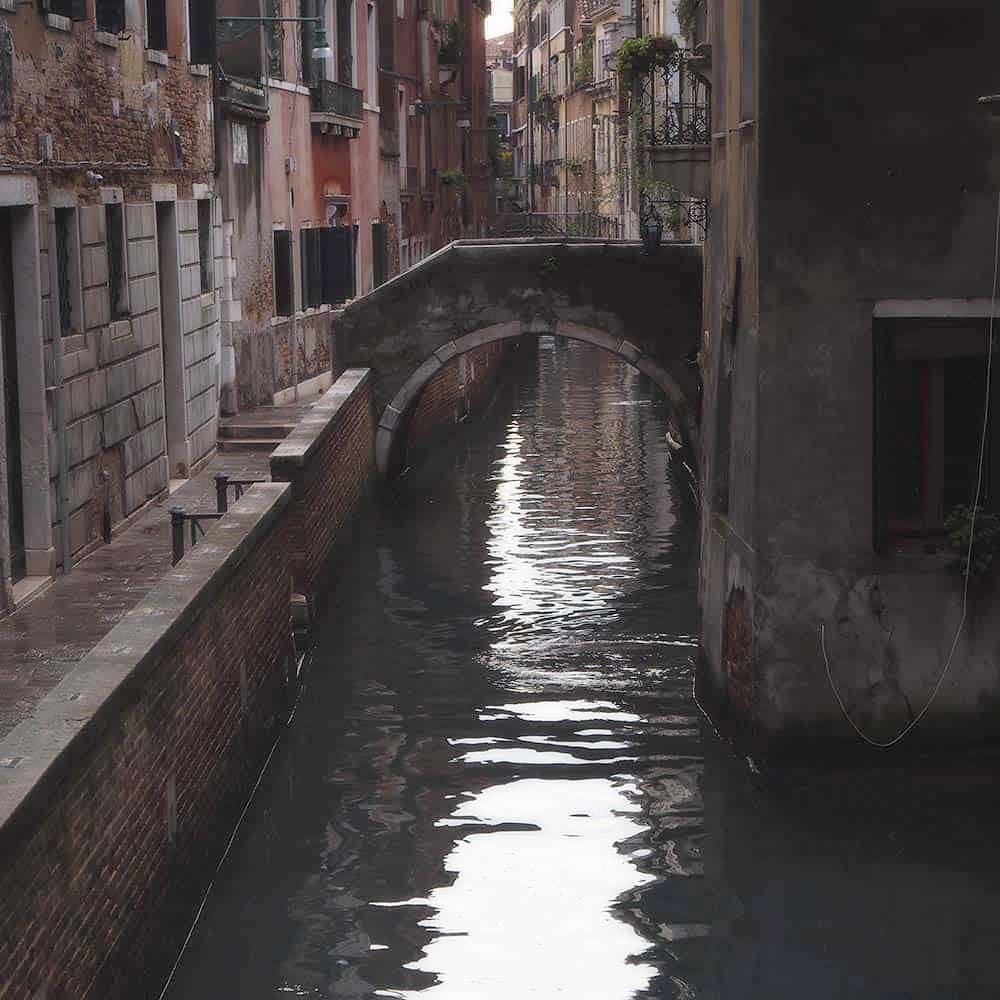
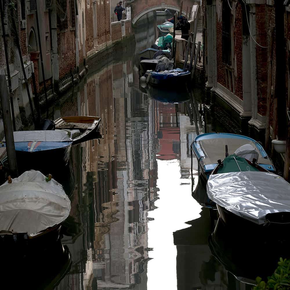
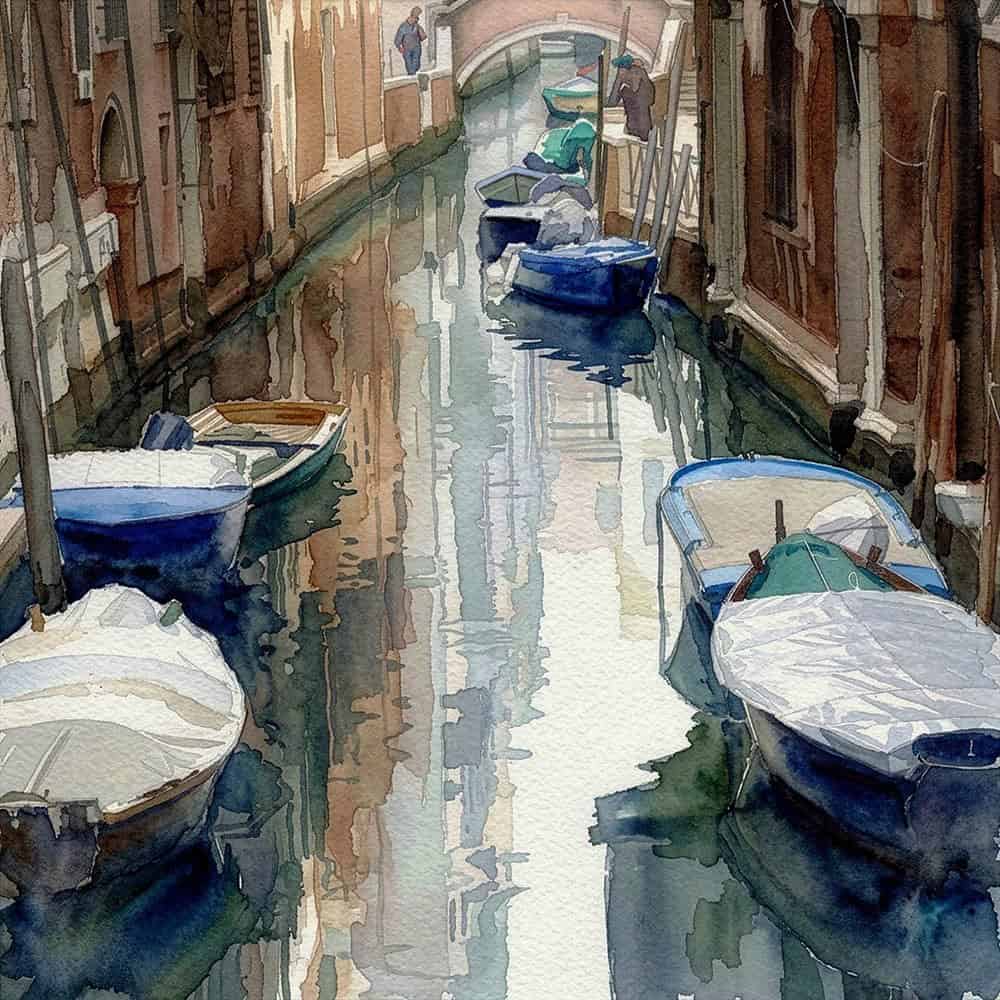
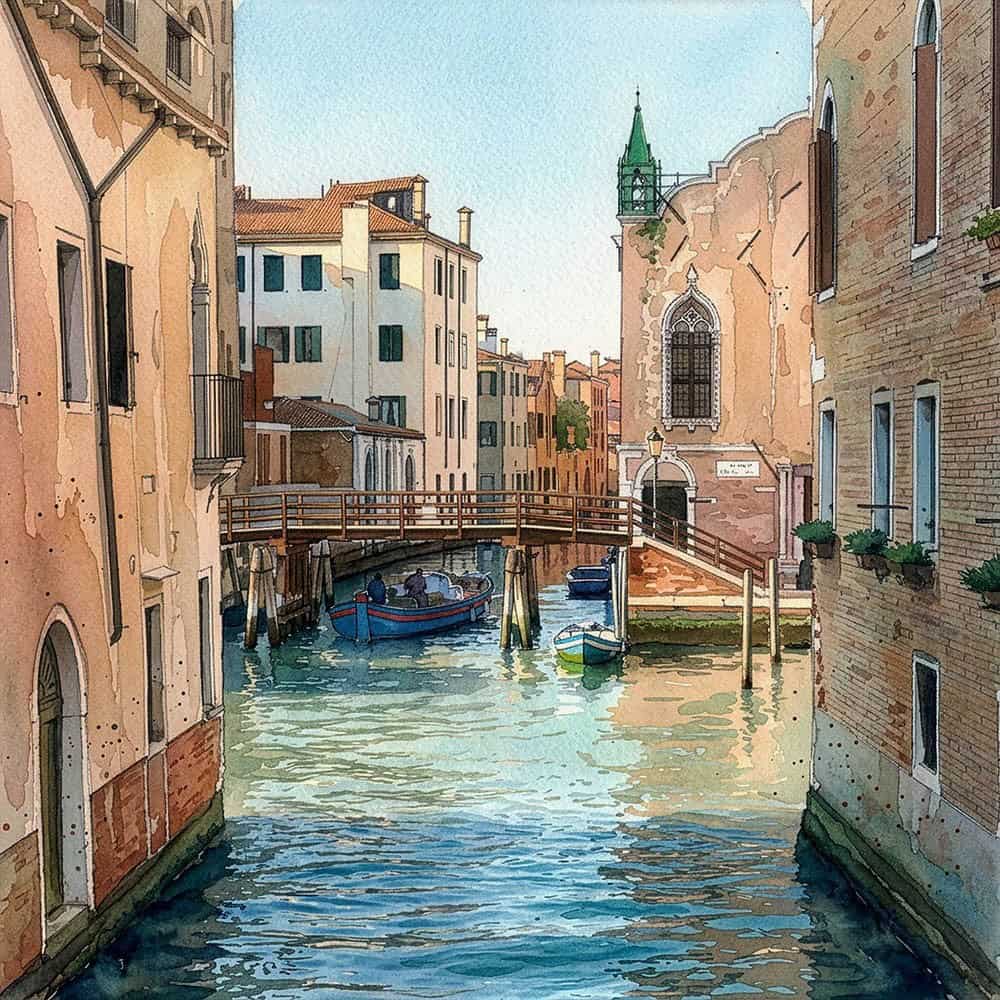
The first and third photographs below, represents my approach to photographing the small canals and associated pedestrian walkways. Firstly, I take a slighlty elevated viewpoint, usually from from a bridge and shoot straight down the canal’s axis. I also tilt the camera downwards to eliminate much or all of the sky, which concentrates the eye’s focus onto the water, surface reflections and any boats or structures etc. This also has the effect of setting the mood and atmosphere of the image – eg, whether in full sunlight, shaded on one side and bright on the other, or in full shade. In these examples, the whole composition is tightly framed and integrated – the image is “low key”, achieved by slight under-exposure, which also gives the low tones a more “monochromatic” feel. This main focus of these images is on the “light”, both direct and reflected. They have a strong mood and atmosphere, and reflects a life little changed over time, how people got around – by boat or on foot. Even considering the sheer density of buildings, one can imagine the isolation for most residents, to one particular parish or community.
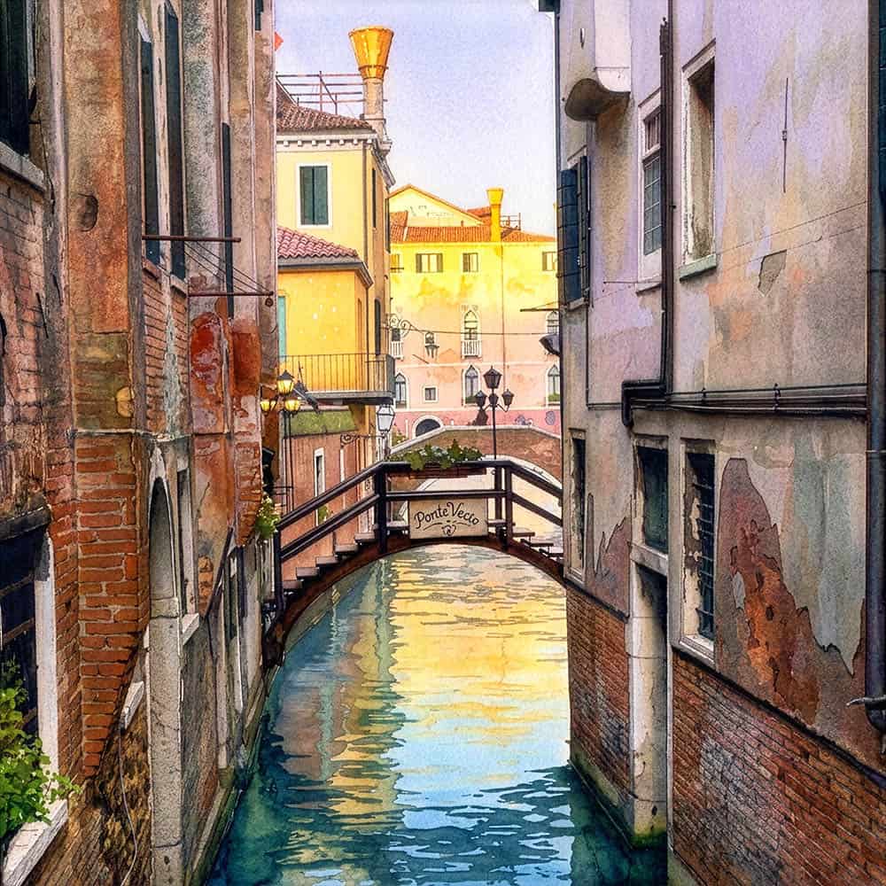
The first set of images use the Gemini 3.1 (Nano Banana 2) generative model. Note, how the composttion or structure of the original photo is retained. The derivatives move many of the darker tones towards the mid-range, changing the whole presentation, its mood and atmosphere, and the way it communicates its message. This more basic conversion software is rather inconsistant and occasional throws framed images and other odd effects. Appently, it
I like, however, its simpler way of creating a watercolour effect, than the other GPT Image 2 model generated images, shown further below. It often gives more “wash effects” in the brushwork, and gives a good sense of the background paper texturing, where present. It has to my eyes, a good balance of warm to cool tones. It gives the overall image a feeling of “calm”. However, there is an “immediacy” of communication, in a sense that the eye does not need to keep scanning the image. They are beautiful in their own right, but quite different from the original photograph and certainly changes the way they communicate
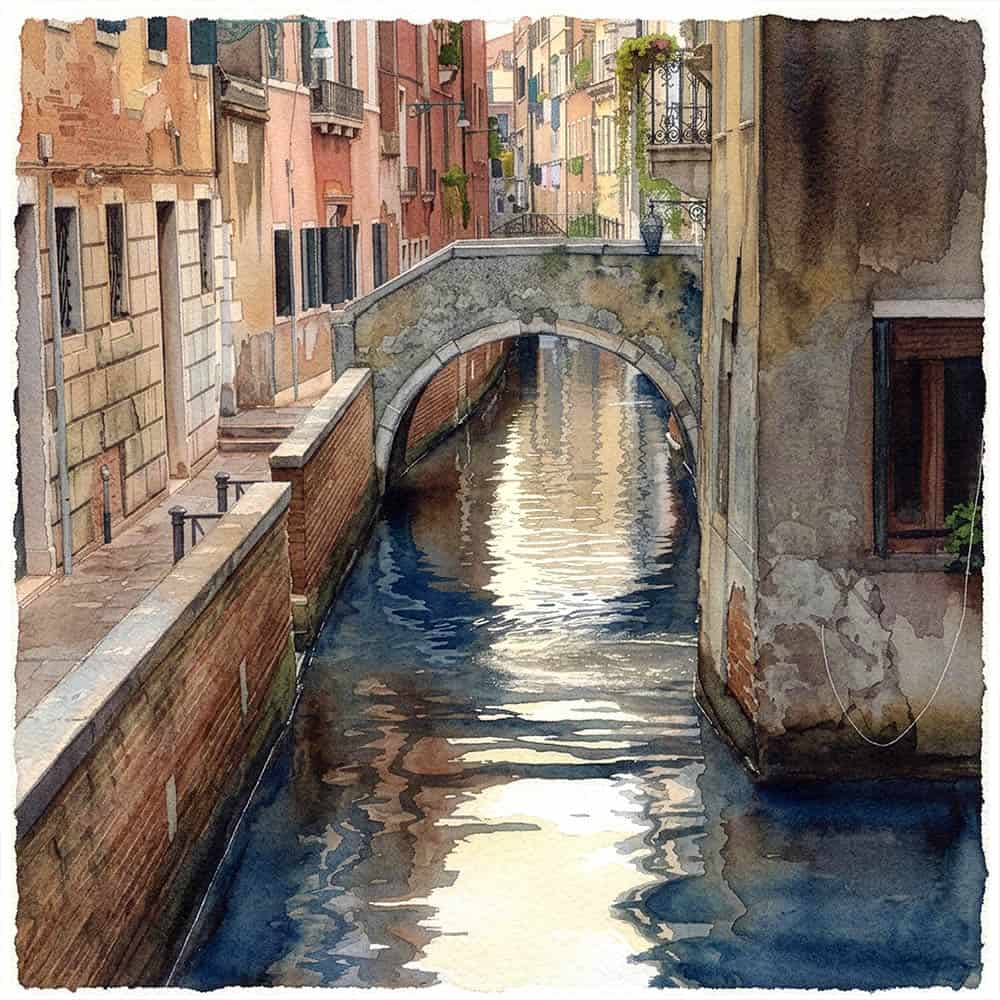
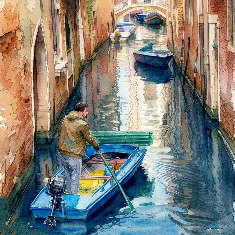
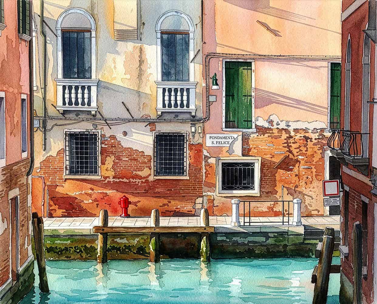
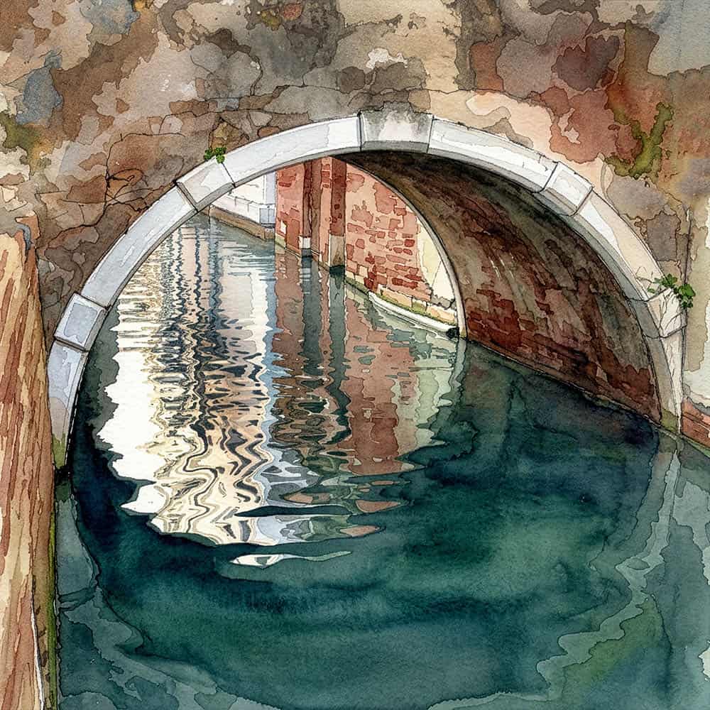
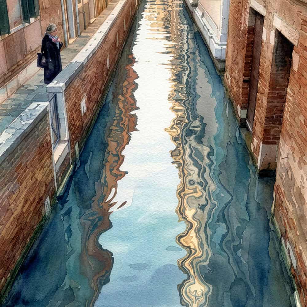
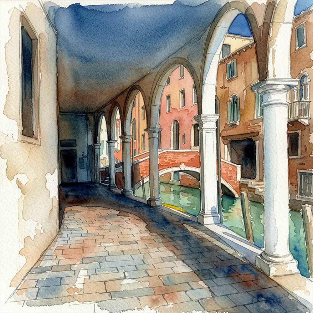
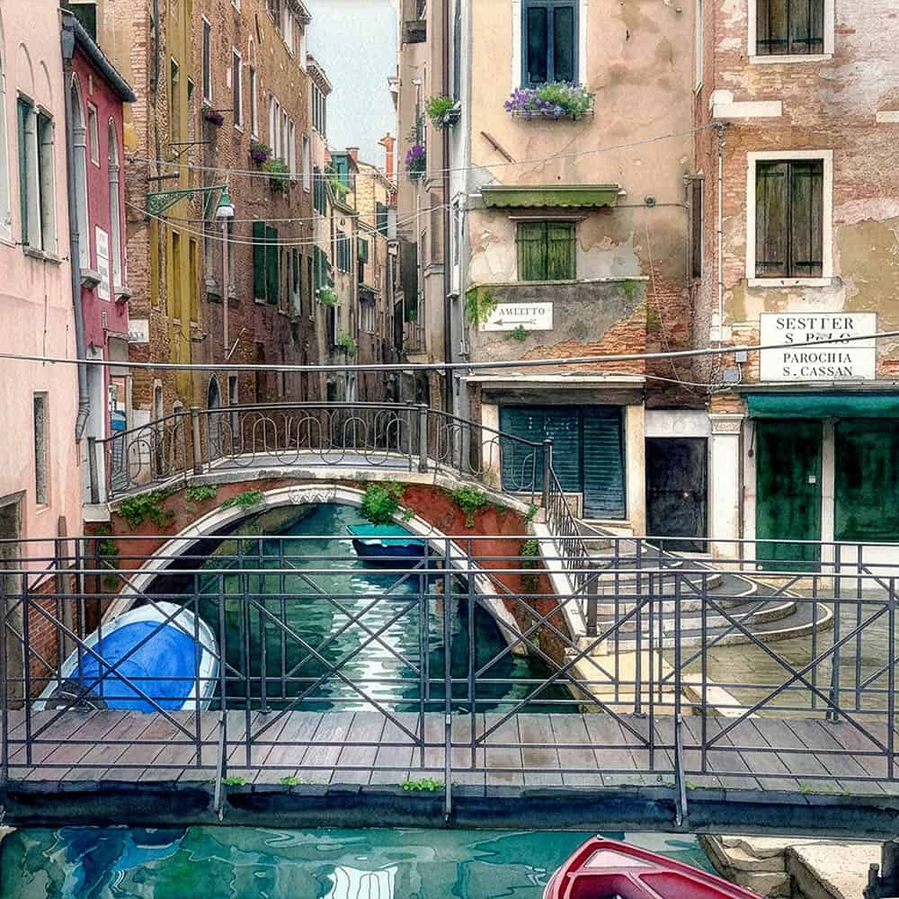
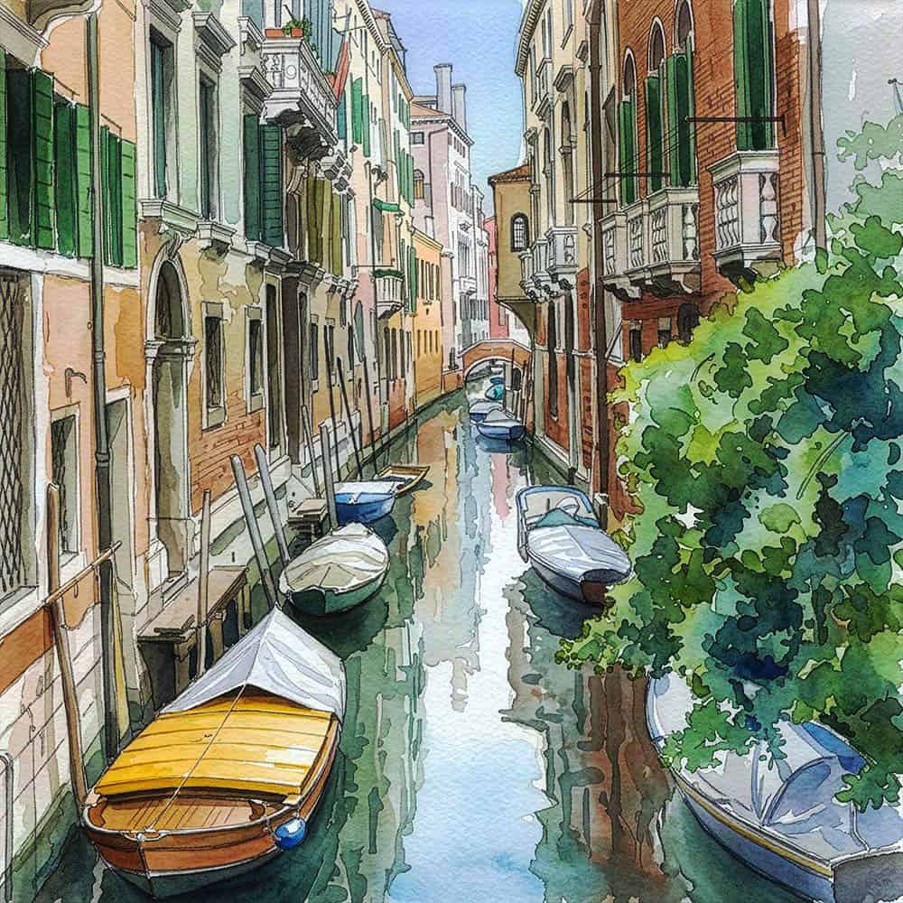
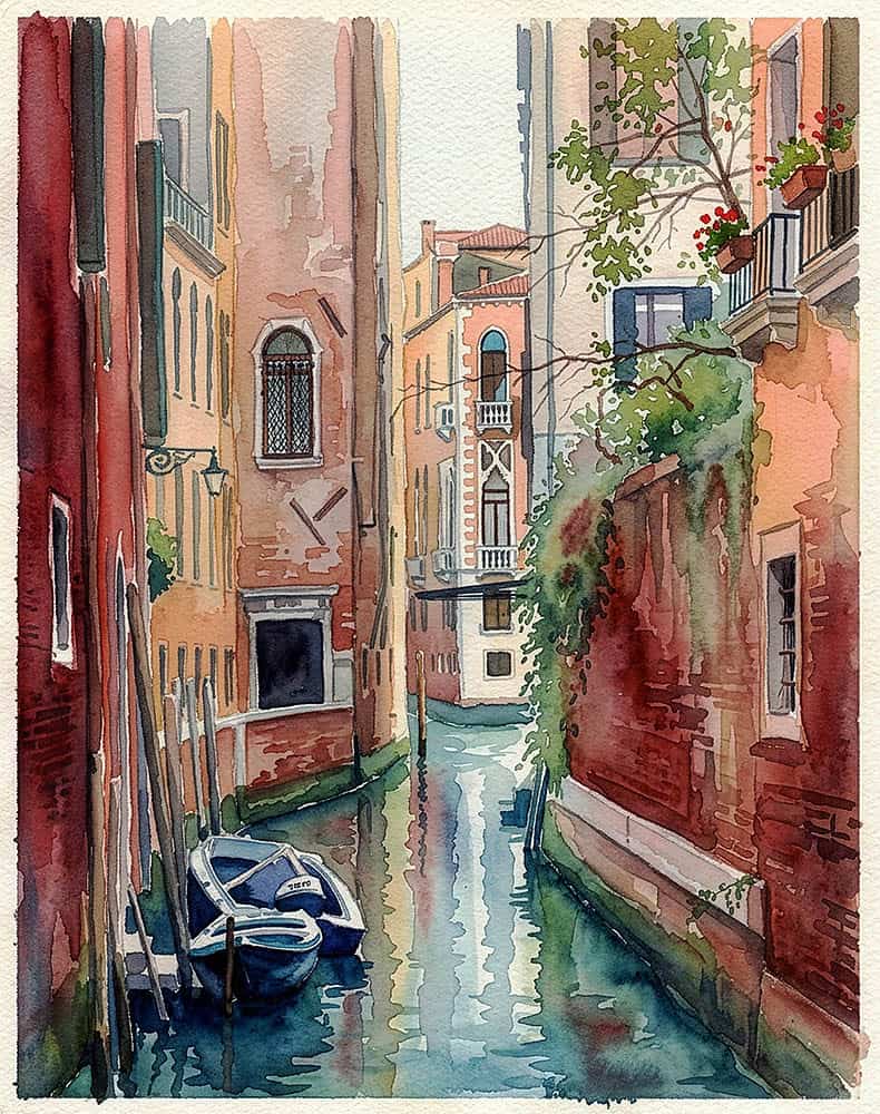
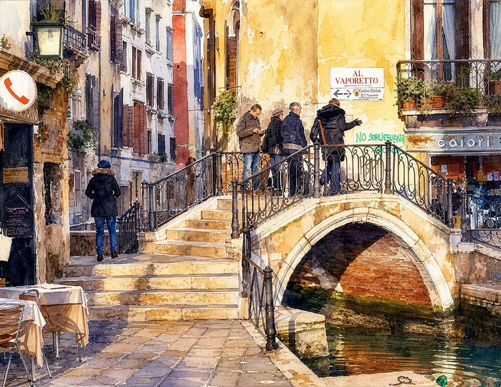
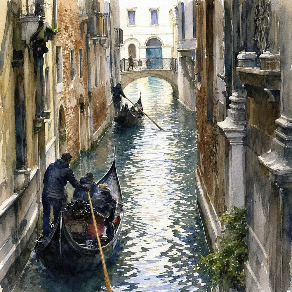
The following images were made using the GPT Image 2 @ medium setting.
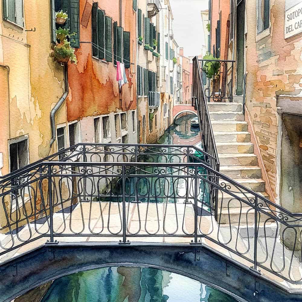
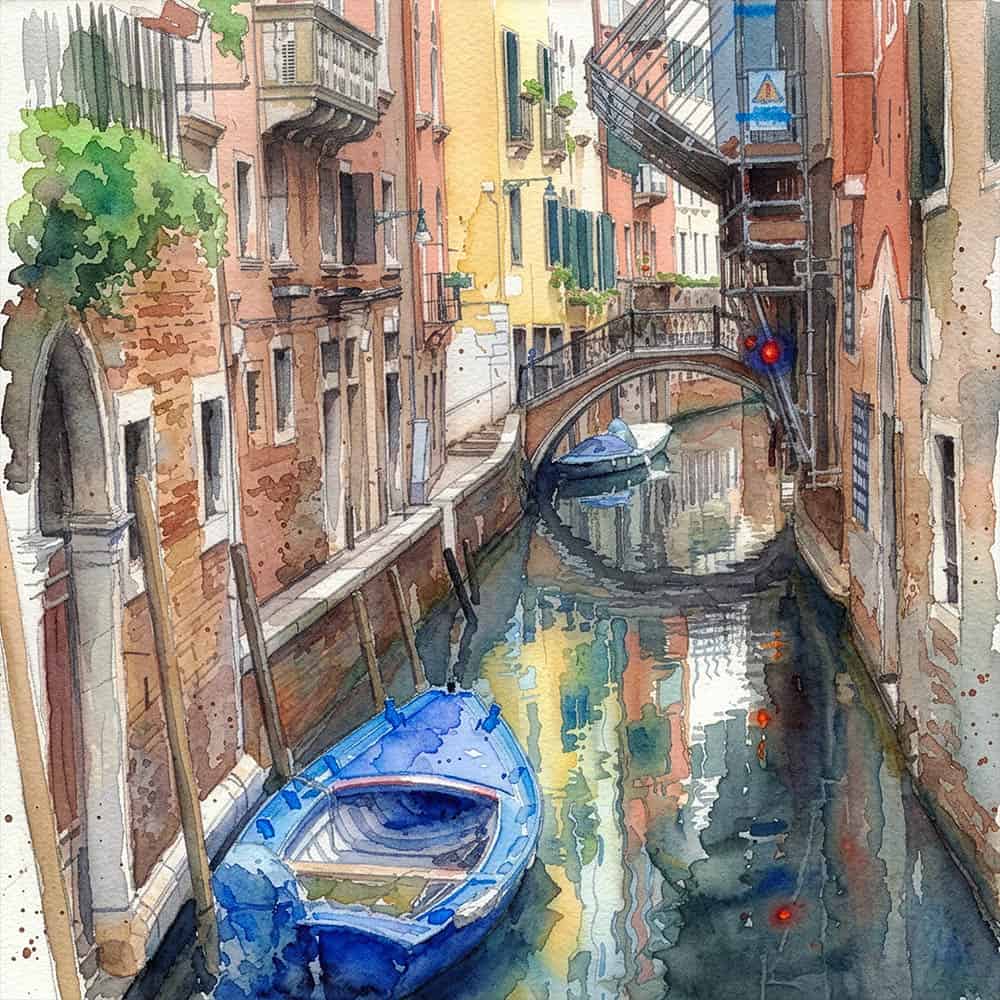
In contrast, the GPT conversion was different in its presentation – a much more noticeably detailed and finer brushwork with greater colour differentiation. Also, an overall increase in contrast and brightening of the lower tones. A really different watercolour look and feel, with this program. The sense of calm or quiet has disappeared – giving a more busy feel. This program gives outstanding detail, but consistantly gave a strong unnatural and false bias towards the yellow to red colour spectrum. Considering the buildings (and their reflections in water) in Venice, are frequently in that yellow to pink/red terracotta range, that overall effect to my eyes was that it spoilt the beauty of the generated image. The blues were reproduced, but overcome by the warm tones. It also lessened the feeling of depth. (Think Cezanne – who juxtaposed blocks of warm and cold tones to create depth other than by linear and atmospheric effects.
In all the conversions below, made with this program, I reduced the yellow and red saturation by at least 5 points each and moved the colour balance to the blue spectrum by at least 10 points or more! The blues were reproduced, but overcome by the warm tones.
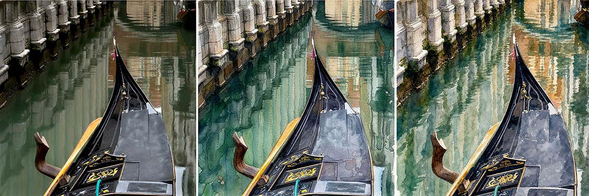
Left. Colour photograph. Middle. Gemini 3.1 (Nano Banana 2) @ 1K. Right. GPT Image 2 @ medium.
I made this quick composite to compare the original photo with the two Adobe regenerative programs. Taken on an overcast day, the canal water in this tightly composed photograph was reasonably still, with some light rippling, but the reflections were quite stable. In the Gemini 3.1 watercolour, the lower tones are brightened towards the midrange and the contrast was increased. The overall effect was airy and calmer. In contrast, the GPT conversion was noticeably different. A much more detailed and finer brushwork with greater colour differentiation, noticeable particularly in the water reflections. Also, an overall increase in contrast and brightening of the lower tones. A really different watercolour look and feel, with this program. The sense of calm has greatly reduced, with the water reflections given extra movement, resulting in a more “busy” or “agitated” feel to the image – to my mind, less in keeping with a “gondola at rest.” The GPT image, after yellow/red saturation and colour caste corrections, still shows the tendancy for this effect, especially in the top right-hand-side of the image.
This program gives outstanding detail, but consistantly gave a strong unnatural towards the yellow to red colour spectrum (see uncorrected image below). Considering the buildings in Venice are frequently in that yellow to pink/red terracotta range, that overall effect to my eyes, was that it detracted from the beauty of the generated image. It also lessens the feeling of depth. (Think Cezanne – who juxtaposed blocks of warm and cold tones to create depth other than by linear and atmospheric effects).
Links (internal–external)
AI-Generated photography is becoming commonplace – my “Depicting Venice. Turning Photographs into Paintings” post linked below, offers my first foray into AI-generative artwork, that also covers: 1. Details about Firefly AI software and a summary of its main features. 2. The ethical concerns and frameworks surrounding the use of AI in photography. As AI continues to advance, these frameworks will likely focus even more on transparency, disclosure, provenance, verification, and accountability to maintain trust in what we see and believe.
My “Photography to AI-Generated Artworks” posts:
Depicting Venice. Turning Photographs into Paintings It also covers: 1. Details about Firefly AI software and a summary of its main features. 2. The ethical concerns and frameworks surrounding the use of AI in photography. As AI continues to advance, these frameworks will likely focus even more on transparency, disclosure, provenance, verification, and accountability to maintain trust in what we see and believe.
Here are my other photography-based blog posts:
- The Sottoporteghi of Venice
- Photographing Venice-Towards Minimalism-Part 1
- Photographing Venice-Towards Minimalism-Part 2
- Photographing Venice
- Venice – Developing a personal vision
- Depicting Venice – Ian Coulling
- Depicting Venice 2 – Ian Coulling
- Depicting Venice 3 – Ian Coulling
- Characters in Stone
- Photographing Venice – Transforming decaying walls into art
- Photographing Venice – Old Doors and Service Boxes
- Why I love Venice
A quick search revealed these alternative, free of charge software websites, that you might like to investigate, to transform your photos into stunning paintings.
- Photo to Painting: Turn Picture into Painting Online Free | Fotor
- Turn Any Picture Into a Painting Online For Free | Picsart
- Photo to Painting – Instantly Turn Your Photo Into a Painting BeFunky
- FotoSketcher – the 100% free program to turn photos into paintings
- Photo to Painting AI: Turn Photos Into Paintings Free Online – NightCafe
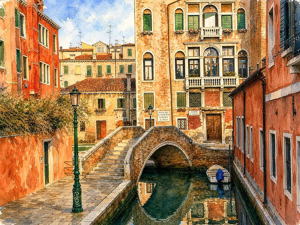
The Backstreets of Venice The Backstreets of Venice The Backstreets of Venice The Backstreets of Venice